
For anyone not keeping tabs, as part of
a publcity stunt brand-optimization for their new day-and-date pricing for downloadable comics, DC is
“Ultimatizing” most of their books
for however long it takes to get to the big crossover that undoes it for real, yo. Previous previews have
shown off the “new” versions of the “grownup” heroes, and now
the teenaged guys have their debut – because the only thing funnier than seeing what 40-50 year-old comic book publishers (and Warner Bros. executives) think ‘the kids’ will consider ‘fresh and relatable’ is what they think ‘the kids’ will consider ‘cool.’
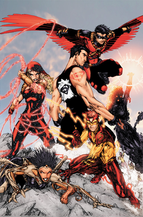
Pictured at the the right: “The Teen Titans,” which DC assures us is the actual book, and not the tongue-in-cheek “What Would ____ Look Like As A Shitty Mid-90s Image Title” sketch from someone’s DeviantArt page you may have assumed. Check out Superboy’s badass tat’ (how does that work?) and too-intense-to-care cloth-scrap logo. Word. Not pictured – yet making the whole bit “complete” – is that the Rob Liefield (really!) is on one of the other titles.
 For anyone not keeping tabs, as part of
Just curious Bob — could you explain your hatred towards Image?
I know they supposedly spurred on the big comic book crash of the mid-90's with their practices, but do you have a reason besides that?
I really enjoyed some Image stuff back in the day. Granted, I was a teenage boy when it was coming out, and I think that's what they were geared to, but I still think they had some quality stuff.
LikeLike
Superman's cape looks like a pice of paper that's been taped to his back, much like a “kick me” sign. I wonder if someone at DC saw the Zangief Kid video and thought that bully victims are what's cool right now.
LikeLike
I always love your big picture by my heart and you're my regular film critic next to Roger Ebert but I can't get your hate for grittyness. I mean I know thay I look like one of the guys all the mainstream hollywood exec targeted at me but come on. Everything looks better when it's a little gritty and realistic.
We all love some new take on characters and when DC does what we individually sketch on their comics why this becomes so hateable?
Another thing is altough Spider-Man costume's new design sucked, this doesn't mean all of the new interpretations is going to suck, like taking panties out is great move and I don't care about classic look. We all know Superman's classic shield on his chest and Batman's stupid-ass mask. So, I'm okay with tattoo (even though I wonder with what ink they scribbed this in, in superman four seasons the scissors were breaking trying to cut Supe's hair
LikeLike
I was holding out for hipster Superboy… Superman logo Tats, fedora with an S on it, V neck revealing like a buck deer tatoo, crappy mustache, overly groomed hair, and a pair of those plastic sunglasses you would catch in a parade. Maybe he could have ironic tats of his own villains and an ironic lex luthor for president T-shit.
LikeLike
What? Rob liefieled!? Oh its christmas in the summer.
@Angry
Being from the mindset of the 90's is usually a good enough reason for a lot of people. I mean some real terrible crap went down. It really soured for a lot of people, even if a whole lot also liked it at the time and wont fault it for being what they wanted.
@Aral
Thats a subjective opinion towards a certain asethtic. Not that there is someting wrong with some grit or realism (We all seem to have loved Watchmen after all), but for a lot of us hearing “gritty and realitic” means we are about to get something dark and muddied in color, with some needless violence and gore.
I think BoB gave a diatribe in a game overthinker episode. The one where he compares the comic industry to the videogame industry. I think its episode 11.
LikeLike
Honestly, Kid Flash and Red Robin actually look pretty solid; not great by any stretch of the imagination, but certainly far from awful, too. Superboy, though…look, I can at least get the muscle-shirt-and-tattoo thing; not to my taste, but it's aesthetically coherent and at least not actively hideous. But I cannot even begin to wrap my head around the taped-on paper “S” shield; if there is a more singularly inexplicably stupid costume choice in the history of Super Heroes, I cannot think of it.
LikeLike
@Angry Man
The costumes simply ruin the characters. I mean, look at Cass! She went from a girl who wore jeans and a simple breastplate to some scantily clad outfit.
Superboy's outfit looks as if it was some villainous parody of the original. And Kid Flash's costume is simply trying to hard.
Robin's isn't terrible, but it's embodied in useless patches and belts that add nothing to the costume. Admitidley, Robin's costume would be fine without all the useless junk on it.
Other than the costumes, there's more. Characters standing still trying to look cool? Check. No one's feet showing? Check. White eye-syndrome? Check. This simply is a 90's cover modernized.
LikeLike
I was originally excited about this reboot because I didn't get into comics at the right time and therefore never was able to get into it due to the gonzo continuity. I just stuck to the cartoons and movies, blissfully ignorant of the multiverse.
I figured, “Hey cool, now maybe I can get into this since they're starting fresh.” Now I'm hearing that isn't the case, so now neither I nor my girlfriend (both of us were excited about this) won't become new readers.
Also is that Static I'm seeing? I didn't know he was in the DC Universe, I thought he was just from this dopey show I remember airing on Kids WB.
LikeLike
Some of it isn't bad. I like what they're adding to Robin, but it does feel quite 90's, which even though it was the most awesome decade, did have poor comic book development, and did deserve the term “The Dark Age.”
It looks like the whole “Radical” teen thing which instantly disuades me from a decent premise.
LikeLike
@J.C To provide a brief history of Static:
Static was originally a comic book character from Milestone Media, a comic book company founded in 1993 by black writers who felt minorities were being given a raw deal and wanted to change that. He was created by the now deceased Dwayne McDuffie (Justice League Unlimited, I think Ben 10)
I think Milestone was eventually bought by DC, and their was an event where the two Universes combined and intergrated. Static went on to become a Titan and other stuff. There was also a TV series which from what I've seen was O.K, but toned down the darker elements of the comics like gang war and homosexuality.
LikeLike
@J.C
I suggest giving it a try. Fact of the matter is this is a new beginning for DC and most of it heroes. There are also new titles altogether like I, Vampire and Voodoo.
For me it seems like there will be something for every one here. Simply, if you see something you might like, try it. If someone suggest something that you might like, try it. This is how we discover new and good things. If you completely dismiss something because of a misguided idea, you may miss out on something good.
http://dcu.blog.dccomics.com/2011/06/07/dc-embraces-its-dark-side/
LikeLike
I don't mind the grittiness so much from Image/Wildstorm/Top Cow/etc. (I was a huge fan of Stormwatch and The Authority during Warren Ellis' run), or even things like Marvel Max and DC Vertigo because those universes were built from the ground up on it. Yeah it was often taken to excess, but silliness was taken to excess in the Silver Age.
I find grittiness silly when applied to the Marvel “space opera, flying carriers and giant robots” main continuity and especially ridiculous for the DC continuity with its almighty Golden Age demigods running around. But at least in that picture everyone's fully clothed and reasonably proportioned.
LikeLike
its official folks.
WE HAVE RETURNED TO THE 90'S!!! HIDE THE CHILDREN!!!
LikeLike
Well, this is what happens when Jim Lee becomes the figure head for your company.
LikeLike
Ugh. I hate ultimate marvel.
Though some of these costume revisions are pretty good. Wonder woman's is relatively untouched, although I would prefer a skirt like greek soldiers instead of pants.
Red Robin looks really good as well. Robin is a very hard character to make not look incredibly stupid. I'm digging the colour scheme and wing cape. Kindof like a fusion of movie batman and the vulture.
Kid flash looks like XO Man of war, and superboy? It says alot about his design over the years that the tshirt and leather jacket form the 90s is one of his stronger looks.
Wondergirl looks like elektra. No idea who the chick on the bottom is supposed to be.
The main heroes are largely unchanged. Though I miss aquaman's hook hand and beard.
LikeLike
Bob, seriously. You're spreading misinformation. I'm not even talking about the part where you're clearly not happy about this; that I don't care about. I'm talking about your misrepresentation of what's happening.
Stop being part of the pollution, because the next time you bitch about the lack of quality control, I'm pointing my finger straight at you for being a fucking hypocrite.
For everyone else who actually might want to listen to reason: DC is NOT “Ultimatizing” most of their books. The new DC timeline actually takes place a few months after the current comics. It is as-of-yet unclear how much in terms of character origins will be changed – if at all – considering the majority of the books are just being ported straight over without their continuities being touched.
It's all the same continuity for GL, Batman and other characters. Batman: Dark Knight #1 is actually #3 but with a #1 on it to conform to the other #1s. This goes with many other ongoing titles that are continuing publication in spite of Flashpoint. NOT a “reboot” or an “Ultimatizing”. I've explained this before, as has Dan DiDio and Bob Wayne.
But clearly, you'd rather pontificate further and spread the same problems you yourself whine about than actually look something up to speak from a position of knowledge before you open a mouth about it. It'd be nice to know what sources you're getting this erroneous information. Of course, that assumes you're being
Also, your claim that this is all “part of a publcity stunt brand-optimization for their new day-and-date pricing for downloadable comics” is incorrect. This is the same kind of talk that made retailers freak out when they heard this news. It isn't true; it's an angry fan-made distortion on the upcoming events.
Only a few comics are being made available digitally, including the new #1s. But they can't – and won't – be available the same day digitally, because editorial edict is forcing books to be in the can by August 31st or they won't get published (at least not on time), and that schedule doesn't jive with Apple's need for advance notice and uploads.
Getting your facts straight requires little else than a few moments of your time and being able to competently operate a Google search. It's nearly no effort at all. So, either stop misrepresenting facts before you get your opinion wound up over nothing more than a figment of your imagination, or stop posting about DC – period.
It's becoming more and more difficult for me to take you seriously…..
LikeLike
Red Robin looks alright, Kid Flash looks the same just made more needlessly overcomplicated, Wonder Girl kinda reminds me of Lady Shiva with a hood, Superboy seems to have been Smallvillerized for some reason, The lady on the bottom is supposed to be Starfire (apparently, looks more like Witchblade from Image Comics), and I'm gonna call the one on the right as the re-do of Raven
LikeLike
@Matthew: It's not Starfire. According to the artist (Brett Booth) on his blog, “THe Girl on the left is a new character, but I did toss in some WS feel to her that MAY play out in the future.”
By “WS” he means “Wildstorm”. And yes, he did actually write “THe” instead of “The”. It's a direct copy-and-paste.
The smokey-looking one is actually called Charcoal Girl.
There's an additional team member who doesn't show up in THIS picture but in others, called “Elastic Lad”.
Brett ALSO writes:
“And I do have to say I'm sorry to all the pissed off people. But sales were low, things needed to change. We'll have to see what happens in September. But the new story's are solid and fun. Sorry you won't be there. You might see the 90's stuff as a throwback, I see what you're reading now akin to an 80's throwback. Which to me is still good comic fun. So why not wait and see before wasting so very much time on guesses? Check out the first issues, that's what I do when I pick TV shows to watch. If it looks good/interesting I give it 3 episodes. Then if I still like I record the series. Not so hard now is it? Once it's out and you can actually know why you don't like this and then, then you can bitch.
Best!
Brett “
Clearly the very '90s look is not a “company-wide” thing, but a “Brett Booth artistic choice” thing. So, Bob, why don't you get off your anti-DC high horse and see things for what they really are – as opposed to your usual fiction – before you shoot your mouth off about them, eh?
Maybe Bob – and everyone else – should take a proverbial page out of Brett's book and understand this ISN'T the same Teen Titans and the book should be judged on its own merits upon its release.
Oh, and hey Bob – instead of moaning, why don't you actually help to make a POSITIVE difference by writing constructive things instead of propagating mistruths?
LikeLike
@Everyone: This ISN'T A REBOOT. IT TAKES PLACE A FEW MONTHS AFTER THE CURRENT CONTINUITY. ANY RETCONNED ORIGINS ARE A RESULT OF FLASHPOINT BUT MOST BOOKS ARE BEING DIRECTLY PORTED OVER WITHOUT BEING TOUCHED.
*sigh* I can't believe this whole “reboot” bullshit keeps on going. This was cleared up a while ago, straight from someone at DC. READ: http://www.bleedingcool.com/2011/06/02/dc-relaunch-not-a-reboot-holding-the-line-variants-72-discounts/
LikeLike
@existance: If you look at the picture, it was tacked there by Kid Flash (Bart Allen). It's not a regular part of his costume.
@Steve: You wrote “I mean, look at Cass! She went from a girl who wore jeans and a simple breastplate to some scantily clad outfit.”
Uhhh, dude… ARE YOU BLIND? First off, Cassie NEVER wore a breastplate. In her first outfit, she wore a tank top, and in her second outfit she wore a long-sleeved t-shirt. In both outfits the jeans she wore were low-cut and often her midriff was visible.
Here, she's wearing a full-body outfit with a hood and golden armor plating all over. The outfit's pattern and design appear very similar to Donna Troy's black, white and silver outfit, but this time it's red with yellow stars and gold plating.
She's got more clothes on her now than ever before, plus a barbed lasso. Before you continue to complain about how scantily clad she is, I suggest you get your eyes checked and quit yer bitching, please.
You then write: “Other than the costumes, there's more. Characters standing still trying to look cool? Check. No one's feet showing? Check. White eye-syndrome? Check. This simply is a 90's cover modernized.”
Seriously, did you even look at the damn picture? First off, it's promo artwork – did you expect characters in a poster to look like they forgot why they were there in the first place? Secondly, Kid Flash, Charcoal Girl and Red Robin all have feet showing. Third of all, you can see Superboy's eyes and in higher res shots you can see Cassie's eyes. Red Robin and Kid Flash are wearing masks with lenses. The new buglike girl looks like she has reason for her eyes to be blank. Charcoal Girl doesn't really have human eyes.
Quit complaining over nothing before you've even read the goddamn book.
Here's different a pic with the FULL team: http://i469.photobucket.com/albums/rr56/LeoTmnt/tumblr_lmhs8l03oj1qael6bo1_1280.jpg
With regard to the other outfits:
Red Robin's costume: Utility belts I can deal with. It's been Batman's whole schtick since Day 1. I can live with functional costume gear on Red Robin moreso than I can on Cyclops, who never once used any of those damn utility belts. It's loads better than his hideous Red Robin costume from Kingdom Come, and more like his Robin outfit except for the lack of a cape. I'm surprised you didn't complain about how the cape was replaced with wings that are reminiscent of Falcon from Marvel, which is extremely new and different.
Kid Flash's costume: It looks like a Flash costume, and very similar to one of his Impulse get-ups. It's red and yellow with lightning bolds. I'm surprised you didn't bitch about the change to his hair color or how the mask pushes his hair into a fauxhawk.
Superboy's look: There's no indication that this is even the same Superboy as before (who might actually be the new Superman or a different character). This may not be Connor. In any case, his look may actually suggest something unique about this iteration of the character that shouldn't be tossed aside until you know what that is. He might be fresh out of the cloning tank and get a new outfit later.
It's really sad you're decompensating over promo artwork (artwork that has already undergone changes from one iteration of the team to the next – including some color and design changes for Flash and Charcoal Girl – plus one additional member).
Right now we don't really know a damn thing about this version of Teen Titans. I suggest you read it first and bitch later if you still don't like it.
But as it stands now? You're complaining about things that are quite evidently contradicted in the picture itself, and your points have no merit.
LikeLike
They can call it “not a reboot” or whatever it is all they want, I've been to this show before. It'll stick around for a little while, give everything the requisite sales bump, then get zapped back to “normal” – save for whatever handful of revisions the fans/writers decide they actually LIKE – by the next big Event (presumably whatever the Flash version of “Blackest Night” is?)
LikeLike
Dunno what's wrong with you. Tim and Bart (is it Bart? Who knows.) look great. The Superman barcode on Conner is a nice touch, though I'll miss the S t-shirt. Dunno who the bone woman and magma woman are supposed to be.
And no one has ever given a shit about Wonder Girl. The reboot wasn't going to change that.
LikeLike
And once again, Vertigo, the imprint that tends to make the award winning, thought provoking, non superhero lineup of comics gets bent over the post for another whipping.
Justice League Dark, anyone? Fuck sakes.
LikeLike
The Vertigo version of John Constantine will still be around kumahouse. There'll be two versions of the character in print. Just like Punisher and Punisher MAX.
LikeLike
@Bob: You seriously can't be that ignorant……
Oh wait…. you most certainly can.
Vertigo and Wildstorm are being integrated into the main DCU. The imprints were cancelled off. Nothing is getting “zapped back to normal”.
This isn't the same show you've been to before. You don't know about what this is, because you haven't taken the time or energy to do your homework. All you're doing is being a bad influence on the consumer base. You aren't helping be part of the solution.
You are polluting the fandom, Bob. You are just as bad as Glenn Beck. Quit rushing to assumptions and making stuff up.
LikeLike
Don't care.
LikeLike
Ladies and gentlemen, presenting Dave, crusader of truth, justice, and the asshole way.
LikeLike
@Dave
I suggest you tone the attitude down friend, you seem to be taking things a bit too seriously. Having an aggressive tone isn't going to make us agree with you any more or less.
That said:
“First off, Cassie NEVER wore a breastplate. In her first outfit, she wore a tank top, and in her second outfit she wore a long-sleeved t-shirt. In both outfits the jeans she wore were low-cut and often her midriff was visible.”
You are correct in this. I admit, I haven't been with DC for a while, and the last I read of TT was in 2004, maybe even later.
“She's got more clothes on her now than ever before, plus a barbed lasso.”
You are also correct in this, however I'd argue that scantily-clad doesn't mean less clothes. It can also be defined by the specific clothes someone wears. The outfit is very plain, and that's the problem for me. Without a belt, it reminds me a lot of bondage outfits. The hood offsets it, yes, but I feel I'm justified in my opinion.
And no, I did not know it was promo artwork, my apologies.
As for the costumes:
Red Robin: I was going to make a jab at how the cape looked liked it was stolen from Falcon, but I decided that might imply fanboyism to some. I also would like to say that Utility belts can also serve as an aesthetic purpose as well as a practical one, but I feel he has too many belts on him. Is it practical? Maybe, I'd say it depended on what he had in them since Robin is usually very agile and it would probably be bad to weigh him down, but that feels like nitpicking.
Kid Flash: I'll just state it here. I don't like his mask. It has Impulse's original elements, but it just looks awkward with the red “crown” on top of it. The logo's on his shoulders are unnecessary, but other than that, it's a nice costume. I wished they made the top lightning streaks red like the ones from his shoes, that would make him more distinct from the Flash.
Superboy: I don't really care either way if it's the original Superboy or not, it's a bad costume for any character.
“It's really sad you're decompensating over promo artwork”
I find it sad you've cared about people's opinions so much as to aggressively attack anyone in the comments area so much as hinting a dislike towards this picture.
“Right now we don't really know a damn thing about this version of Teen Titans. I suggest you read it first and bitch later if you still don't like it.”
You're right, we don't. The writing could be phenomenal. But I'm not judging the writing now, nor what I think will happen. I'm judging the picture Moviebob posted, and I don't like it.
Look, I respect your opinion, and I give you kudos for calling people out on not doing enough research into this, but you simply are a dick. It's one thing to point out the flaws in one's argument, it's another to simply verbally attack them over it.
As it stands, you're overreacting to everyone in here.
LikeLike
I agree with Bob´s assessment of the long term impact on continuity. If you´ve been reading comics for the past decade, you´ll recognize this trick. It varies in how all encompassing it is but, its pretty standard procedure. This maybe the most all encompassing thing DC has done in a while but… you guys remember Infinte Crisis and 52? It was supposed to rewrite the entire back story for DC. How much does any of that really matter now? Infinite Crisis was supposed to undo the original crisis. Remember House of M? Does anyone remember Supreme Power? Remember how it was originally a MAX title then was brought out of MAX into Marvel´s main line? Remember when it was merged with the Ultimate Universe? Remember Age of Apocalypse, Heroes or Heroes Reborn? Remember how 99% of that really didn´t matter three years later? I´m not saying Flashpoint is going to be bad. I´m just saying these kinda shake ups are pretty routine. The original universe is going to come back. Depending on how successful this is it will either be retconned somehow or some books will continue printing in this universe and run like the Ultimate universe does if this is popular. It´s a mechanism the comics industry uses all of the time. I´d put money on it. On another note Flashpoint is definitely a 90´s throwback. I mean have you read the first two issues? The similarities to Age of Apocalypse are staggering. You´d have to blind not to see them. I bet this franchise mashup will wind up playing out similarly to AoA too.
@Dave take it down a notch buddy. You´re like at a 9 I´m gonna need you at like a 4.
LikeLike
Karligarchy, you're mixing up two different things. House of M, AoA, Ultimate, hell even Flashpoint are not and were not said to be a line wide permanent change. They're just cross overs set in alternate universes, or are just alternate universe lines in and of themselves.
And last I check, Crisis on Infinite Earths did have a lot of permanent continuity changes, such as Golden Age and Silver Age heroes existing in the same universe.
LikeLike
The difference is that those were continuity consolidations. And the characters essentially remained the same. Some continuity was changed but, basic characters were pretty much same.
LikeLike
WTF are you talking about dude? It looks pretty fucking sweet to me. I love the new designs. I don't like how they all look a little to red, some more color variety would be good, but other than that they're really fucking awesome.
LikeLike